
Have you ever booked a realism piece because the fresh photo looked flawless, then watched the tattoo blur into a softer, flatter version of itself after healing? That gap between fresh ink and long-term readability is where most expensive mistakes happen. A strong Realism Tattoo Artist doesn't just make a tattoo look sharp on day one, they plan for how skin moves, settles, and ages.
The UK market makes that distinction worth caring about. Tattoo ownership has moved from a minority habit among older generations to a mainstream form of expression for younger adults, with survey data cited by the Psoriasis Association showing around 7% of people born in the 1950s had tattoos, compared with 42% of those born in the 1980s and 1990s, and about 30% of UK adults aged 18 to 35 have at least one tattoo Psoriasis Association tattoo ownership data. That growth has created a bigger, more professional market, but it hasn't removed the need to judge skill carefully.
Table of Contents
- Why Fresh Photos Lie About Realism Quality
- Technical Skills That Define a Realism Tattoo Artist
- How Professional Studios Match Clients to Specialists
- Black-and-Grey Realism Versus Colour Realism Portraits
- Why Perfect Reference Photos Do Not Guarantee Perfect Tattoos
- Final Checklist for Booking Your Realism Commission
- Next Steps to Start Your Realism Tattoo Journey
Why Fresh Photos Lie About Realism Quality
The tattoo that looked incredible under studio lights can be the one a client regrets most once the skin has healed. I've seen people fall for ultra-close portfolio shots, only to discover that the tiny portrait details have softened into a grey haze, and the likeness is gone. Fresh photography flatters the work, healed skin tells the truth.
Why the first photo is often misleading
A fresh realism piece benefits from contrast, ointment sheen, bright lighting, and a camera angle chosen to flatter the tattoo. None of that survives real life. Skin swells, scabs form, pigment settles, and the sharpest linework can become less distinct if the design was packed too tightly or scaled too small for the body part.
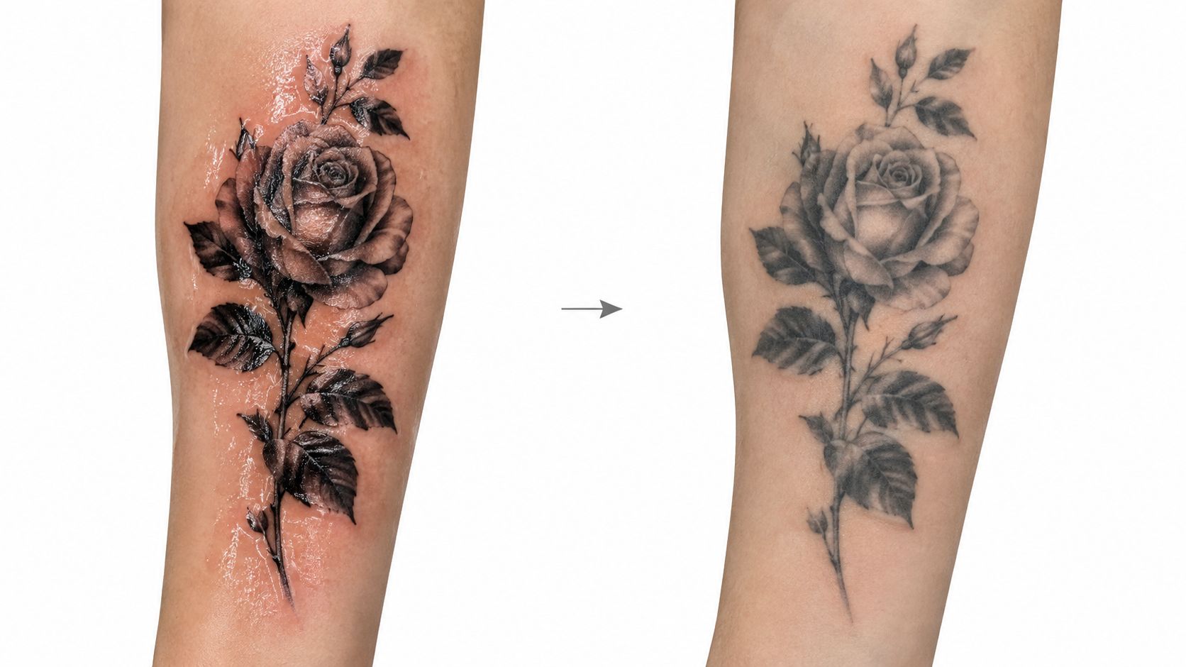
The question isn't whether the tattoo looks impressive at upload size, it's whether the composition still reads from a normal viewing distance after healing. A good artist thinks about contrast blocks, spacing, and placement before they ever start shading. A weak one chases micro-detail that looks clever for a week and then collapses.
Practical rule: if a portfolio is all tight close-ups and no healed shots, treat that as a warning, not a selling point.
What healed work reveals
Healed photos show whether the artist built the design for skin, not just for the camera. Look for portraits and animals where the eyes, muzzle, hair, or fabric folds still separate cleanly after healing, rather than merging into a single tone. That separation tells you the artist understands how to preserve visual structure when the skin stops looking fresh.
A realism specialist also chooses placement with the future in mind. Areas that stretch, rub, or move a lot can punish ultra-fine work, so the artist who advises a slightly larger version is often the safer choice. That's not lack of ambition, it's technical discipline.
When the brief is a memorial portrait, a pet, or a nature piece, the safest portfolio is the one that shows both fresh and healed examples, in different placements, at a distance that matches everyday viewing. The prettiest close-up isn't the best evidence. Healed readability is.
Technical Skills That Define a Realism Tattoo Artist
A competent portrait technician can copy a photo. A true realism artist can translate that photo into a tattoo that still makes sense when the skin stops being perfect. That difference shows up in tonal mapping, needle control, and the artist's willingness to simplify without losing identity.
Tonal control matters more than raw detail
Realism lives or dies on value separation, the clear difference between light, mid-tone, and dark areas. When those zones collapse, the tattoo turns muddy. If a portrait's cheek, shadow, and hairline all sit at nearly the same depth of tone, the face stops reading.
Good realism also preserves highlights instead of burying them. You should still be able to see a light catch in fur, feathers, teeth, glass, or an eye. If every bright area is filled too aggressively, the tattoo may look rich on day one and heavy later.
What clean technique looks like
A strong realism artist usually works with controlled layering rather than one heavy saturation pass. They'll build depth gradually, which protects the skin and keeps gradients smoother. The result is a softer transition without harsh banding, yet the image still has structure.
A few signs separate experienced work from rushed work:
- Clean edges where they matter: eyelashes, whiskers, and hairlines should look intentional, not fuzzy from overworking.
- Balanced blacks: dark areas should anchor the piece, not choke out the mid-tones.
- Anatomical honesty: eyes, nose bridges, skull shape, and mouth placement still need to make sense, even in stylised realism.
- Stable texture: fur or skin texture should support the subject, not distract from it.
Heavy black isn't automatically better. If the skin looks bruised or overworked, the artist may be forcing contrast instead of designing it.
For clients comparing portfolios, the useful question is simple, does the work still have shape without zooming in? If the answer is no, the artist might be good at making a social media post, but not necessarily at making a tattoo age well. If you want to see how a custom-first studio frames that process, the reference material around custom tattoo design is worth studying.
How Professional Studios Match Clients to Specialists
A serious studio doesn't throw every realism enquiry into the same chair. It listens, checks the reference, and matches the client with an artist whose hand, pace, and subject matter fit the project. That matching process matters more with realism than with looser styles, because portraits and colour-realistic work leave less room for improvisation.
What a proper consultation should cover
At consultation, the artist should talk through the subject, the placement, and the practical scale of the piece. If the reference image is too busy for the body area, they should say so. If the portrait needs to be larger to keep the eyes and mouth recognisable, that should be explained early, not after the deposit is taken.
A good consultation also checks the body, not just the image. Skin condition, existing tattoos, curvature, and movement all affect where realism holds up best. That's why consultations are more than sales conversations, they're the point where the design is made viable.
Booking should feel structured, not casual
Professional studios usually move through a clear sequence:
- Consultation. You bring the reference, explain the subject, and talk about size and placement.
- Artist matching. The studio checks which resident or guest artist handles that subject best.
- Booking confirmation. You secure the slot and the studio locks the plan in.
A studio that can't explain who will tattoo you, and why they're the right match, hasn't done enough planning.
For larger commissions, especially portraits and sleeves, the artist may map the work across multiple sessions. That protects the skin and keeps the design coherent from one sitting to the next. It also keeps unrealistic expectations from blowing up the project halfway through.
If you're comparing studios in Dorset, the consultation style and specialist matching process at tattoo studios in Bournemouth is a useful benchmark. Timebomb Tattoo & Piercing also offers consultations and artist matching across its Bournemouth and Croydon studios, which fits the kind of planning realism work demands.
Black-and-Grey Realism Versus Colour Realism Portraits
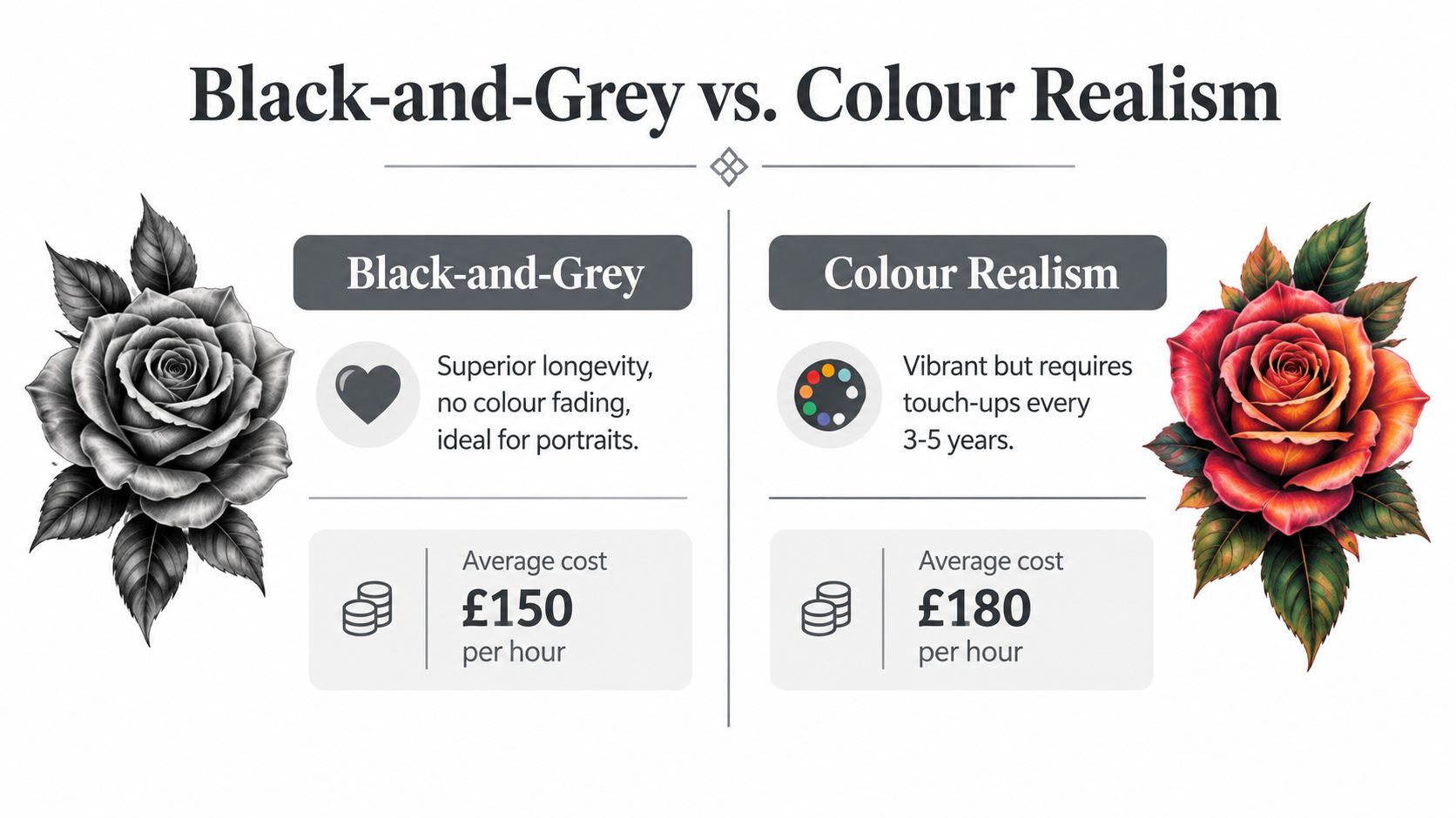
Black-and-grey and colour realism solve different problems. One usually gives you stronger long-term contrast. The other gives you richer naturalism, but asks more from the artist, the skin, and the aftercare.
The practical trade-off
Black-and-grey realism relies on tonal layering, so it often suits portraits, memorial work, and subjects where shape matters more than saturation. Because there's no colour balance to preserve, the finished tattoo can stay readable for a long time if the values were planned well.
Colour realism can be spectacular when the reference deserves it, especially in animals, skin tones, flowers, or eyes. But it asks the artist to manage more transitions, and it asks the client to accept that colour change over time is part of the deal. If the composition is tiny or overly busy, colour can muddy faster than people expect.
Choosing the style that fits the subject
For pet portraits, black-and-grey is often the safer choice if the goal is clarity first. For flowers, bright-eyed animals, or a highly specific memory tied to colour, full colour can be worth the extra maintenance. Memorial pieces usually benefit from restraint, because recognisability matters more than trying to reproduce every photographic nuance.
The internal lesson is simple. Don't ask which style is more impressive. Ask which one gives the subject the best chance of remaining legible on real skin. If you're exploring portrait roses and naturalistic subjects, the reference at realistic tattoo rose shows why scale and contrast matter as much as palette.
Why Perfect Reference Photos Do Not Guarantee Perfect Tattoos
A high-resolution reference can still make a bad tattoo brief. The problem isn't image quality, it's the mismatch between what a camera can capture and what skin can hold over time. Tiny tonal shifts that look stunning on a screen can vanish once they're compressed into a smaller tattoo.
Size and placement decide what survives
A miniature portrait with eyelashes, wrinkles, catchlights, and background texture often becomes a readability problem. The better artist will trim the noise, enlarge the key shapes, and protect the focal points. That doesn't weaken the design, it gives the tattoo a future.
Strong design choice: if the portrait has to be smaller, remove secondary detail before you sacrifice the face.
Sun exposure also matters. Fine detail in exposed areas tends to soften sooner, especially where the skin gets regular wear. That's why a skilled artist may steer you away from a placement that looks good in the chair but ages badly in daily life.
The artist should simplify on purpose
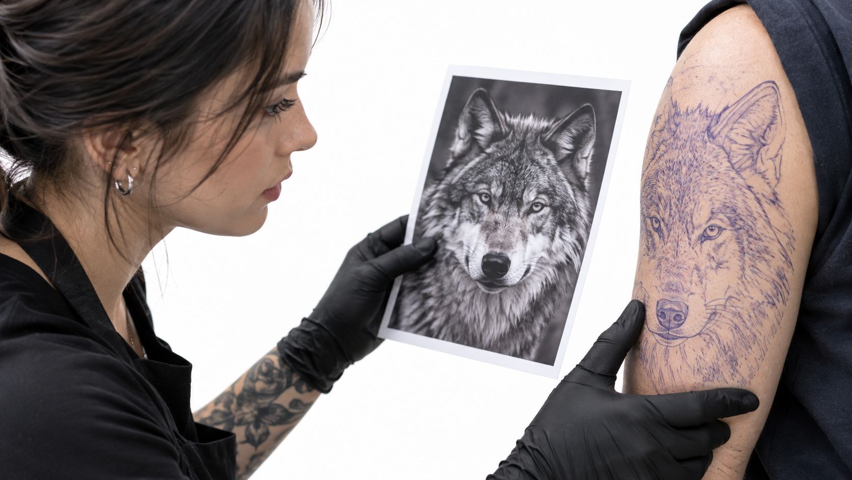
Good realism isn't blind replication. It's selective editing. The artist decides which folds, hairs, reflections, and textures are important, then leaves out the parts the skin won't keep cleanly.
Later in the process, after the tattoo has been mapped, the video below is useful for understanding how a reference is translated into a tattooable design.
That's why the most detailed photograph isn't always the best tattoo brief. If the image only works at phone-screen distance, the tattoo probably needs rethinking. A better brief is the one that still reads when the skin heals, settles, and lives a normal life.
Final Checklist for Booking Your Realism Commission
Before you book, ask for healed examples that match your subject, size, and placement. A healed portrait on an arm tells you more than a fresh macro shot on social media. If the artist can't show that range, you're guessing.
Check the studio's local council registration status, then ask about hygiene procedures, single-use needles, surface protection, and aftercare. England's guidance identifies poorly performed tattooing as a route for bacterial infection and blood-borne virus transmission, including hepatitis B, hepatitis C, and HIV UK infection-prevention guidance. That makes cleanliness a core quality issue, not a background concern.
Use this quick booking filter:
- Portfolio fit: look for healed realism work, not only fresh uploads.
- Scale honesty: ask whether the design needs to be larger to stay readable.
- Placement logic: confirm the area suits the amount of detail you want.
- Hygiene proof: ask how the station is set up, cleaned, and protected.
- Studio status: verify registration and local compliance.
- Aftercare clarity: make sure you leave with written care instructions.
Ask about the right kind of experience
Not every realism artist handles every subject equally well. Portraits, animals, memorial pieces, and colour realism all demand different judgement. Ask what similar commissions they've completed, and ask to see healed work from those categories.
A well-run studio will answer those questions directly. If the answers feel evasive, keep looking. The cheapest booking is rarely the one that costs least in the end.
Next Steps to Start Your Realism Tattoo Journey
Bring three things to the first enquiry, your reference images, your rough size idea, and a clear note about where on the body you want the tattoo. That gives the studio something usable, not just inspiration boards. If you want realism to age properly, the artist needs to know what detail matters most to you.
Use the free consultation to test how the artist thinks, not just how their portfolio looks. Ask whether the design should be black-and-grey or colour, whether it needs to be larger, and whether the placement supports the level of detail you want. If the studio offers multiple specialists, ask who handles portraits, animals, or colour work most often.
Timebomb Tattoo & Piercing works from Bournemouth and Croydon, offers free consultations, and matches clients with artists across realism, portrait, and other custom styles. It also provides body piercing, so if you're planning more than one service, you can ask about both in one visit. For a booking conversation that starts with the right questions, visit Timebomb Tattoo & Piercing and send your reference through with a clear note about size, placement, and the style you want.